User Experience Tips to Improve the Payment Process for Your Clients
Is your business suffering from shopping cart abandonment? Improve the payment process, and you fix the problem and increase your sales.
Today we will share some user experience tips that will help you update your website the right way and increase conversions. Whether you have knowledge in the field of UX or not, you will be able to apply these tips and take your business to the next level.
Allow clients to “continue as a guest”
Are you forcing your clients to sign up for your website for making a purchase? It’s not the best tactic. Modern clients are busy, and they don’t want to spend their time signing up for each and every site they use.
Provide users with “continue as a guest” option, and you will significantly decrease shopping cart abandonment rate and increase sales. Do you need to collect more client data? You can do it after the purchase made.
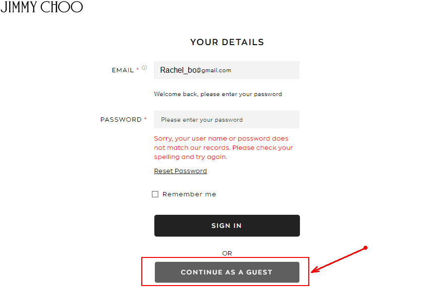
Screenshot source: https://row.jimmychoo.com/
Don’t ask for the card type
Are you still asking shoppers to specify what card type they use? You should fix it immediately.
The website payment tool can identify whether clients are using Visa or MasterCard by the first six digits of the credit card number. So please, don’t bother your clients with the questions on which system can get answers automatically. Remove this step from the checkout process.
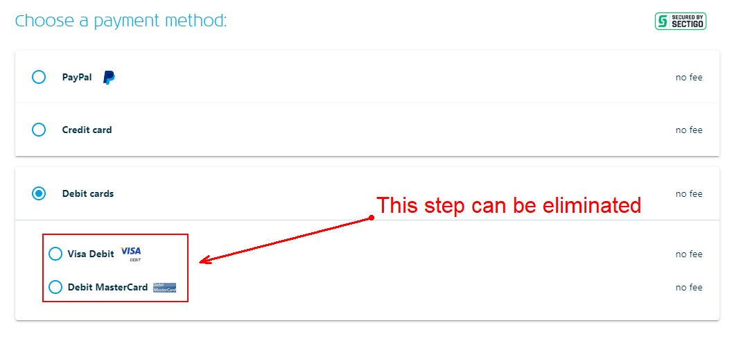
Screenshot source: https://www.klm.us/checkout/payment
Use wallet storage
Do you want to increase the repeat purchase rate? Use wallet storage to securely store payment data of your clients and make subsequent transactions fast and simple. Show your clients that you appreciate their loyalty and do your best to smooth and speed up the payment process.
Take advantage of API
Another way to simplify the checkout process is to ask users to provide zip code first, so you can use an API to pull the city and state.
This small change will help you to make a big difference. By saving two seconds of your clients’ time, you will increase your sales by a few hundred dollars a month.
Help to resolve payment issues
Have you ever encountered an unexpected error with payments? That’s a rather frustrating experience, isn’t it?
For enhancing the payment process, it’s important to provide adequate feedback. You should design error messages that will help users to understand what exactly has gone wrong and what steps they should do next. You can use text messages, animations, sound effects, or vibration pulses.
Since payment issues may upset or irritate shoppers, it’s a good idea to create amusing instructions on how to resolve the issue. You can write instructions by yourself or use legit paper writing services. Whatever option you choose, make sure that texts are grammatically correct and do not contain any sophisticated, rarely-used words that may confuse users.
Write the perfect CTA
What CTA buttons are you currently using on your website? Do they help users to navigate the payment process? You should analyze your website visitors’ behavior and try to understand what words resonate with clients at every stage of the checkout process.
Take a look at the following screenshot. Delta Airlines uses the phrase “Continue to review & pay” instead of “Checkout now”. The company understands that users want to review flight details before paying for pricey tickets.
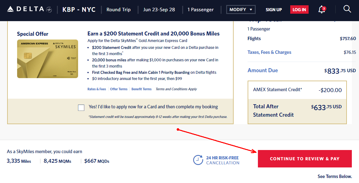
Screenshot source: https://www.delta.com/
Eliminate distractions
Every little distraction can get a client to rethink his purchasing decision. So make sure that your checkout page has a clean, simple design, and that it is free of any texts, images, and CTAs that may distract or confuse the user.
Take a look at the following screenshot. It’s an example of a “big distraction” that leads to a low conversion rate. The company invites the user to take part in a survey right at the moment when the user is about to complete his payment. If you want to keep your business afloat, never make such mistakes.
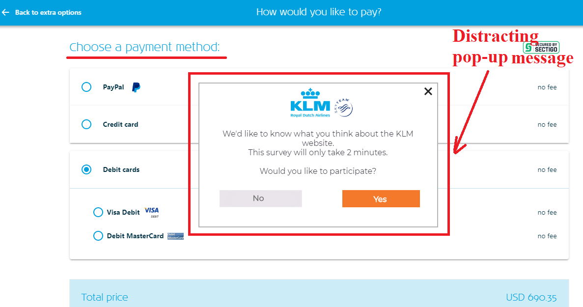
Screenshot source: https://www.klm.us/checkout/payment
Wrapping up
To improve user experience and enhance the payment process, you need to minimize typing and eliminate extra steps. You should ask your clients to provide only that data that is essential for the transaction. Also, you should make the design of your checkout page clean and simple. That’s all you need to make your business a success.
About the author: Leona Henryson is a freelance writer and UX designer for Topessaywriting and other educational resources. Also, she is a contributing writer for various marketing blogs. When she is not writing or designing, Leona is trying to balance her multiple hobbies including hiking and watching movies.